Ing and John’s Street Art, Downtown Newark, New Jersey, USA- Part 7: Kai, The Artist, and Ing and John’s Artwork
Ing & John’s and International Street Art – Part 8 – Thisiscolossal: Murals of Greek Gods Rendered Against a Chaotic Backdrop of Graffiti by Pichi & Avo, and Crumbling Buildings and Graffiti-Covered Walls Are Meticulously Documented in Oil Paintings by Jessica Hess
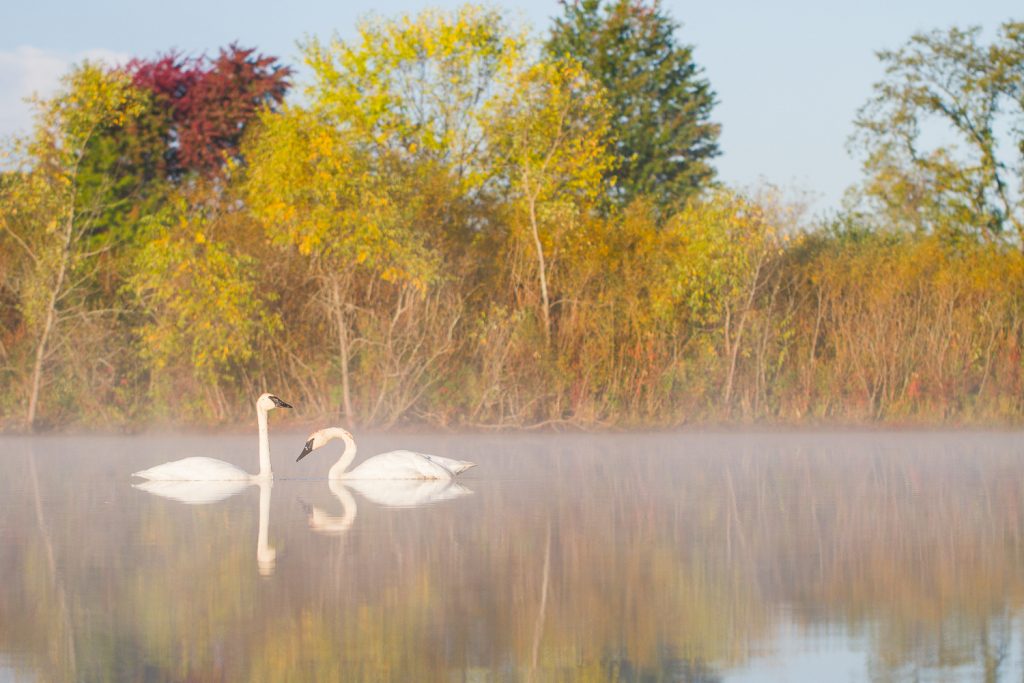
Digital Photography School: A Quick Guide to Amazing Bird Photography Compositions
Ing & John’s Street Art and International Street Art-Part 7
Ing and John’s Street Art, Downtown Newark, New Jersey, USA- Part 7
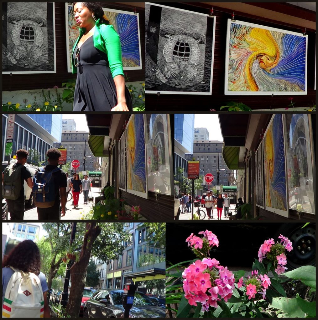
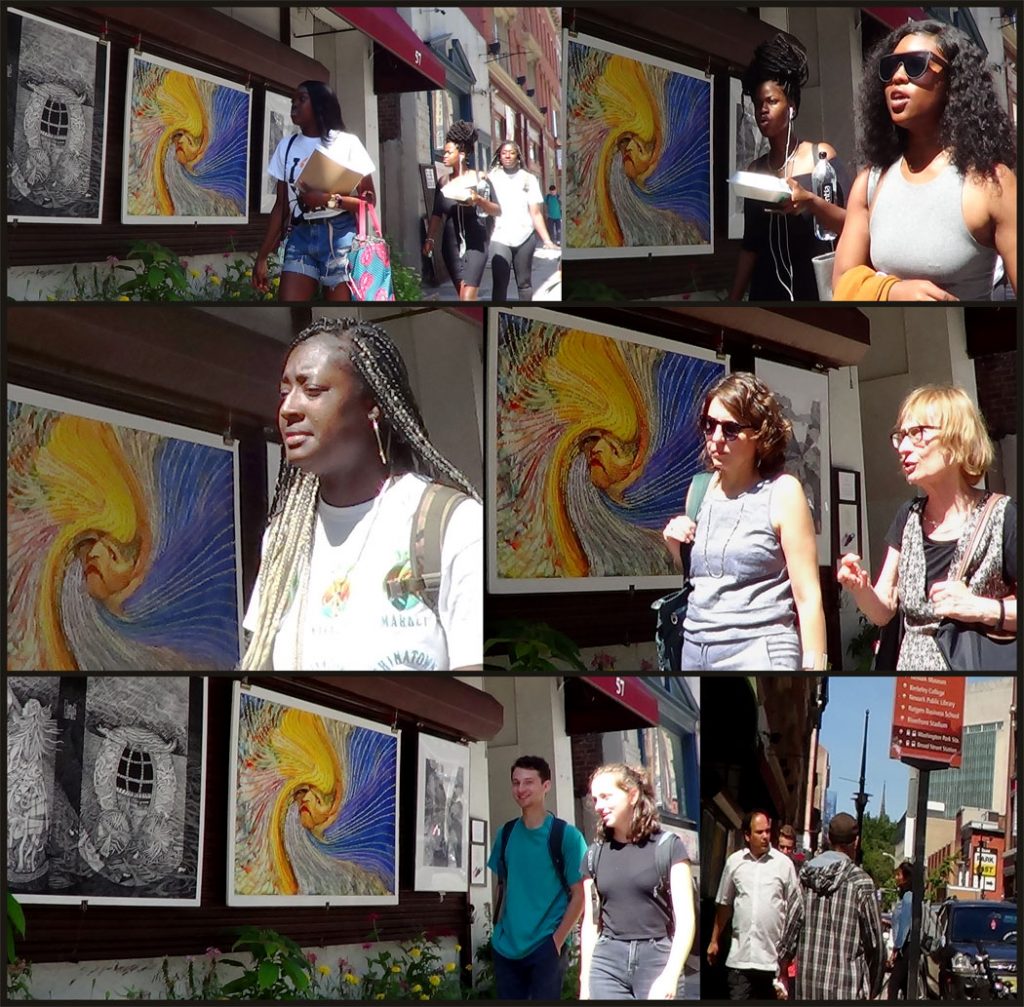
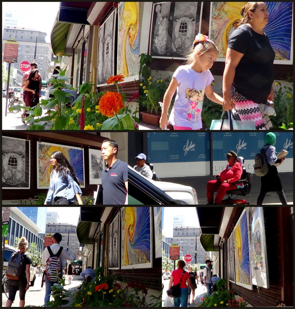
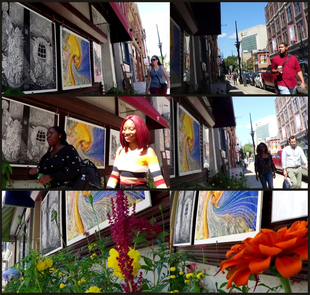
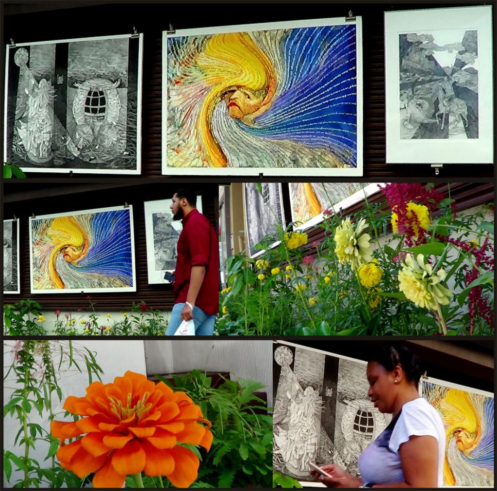
Kai, The Artist, and Ing and John’s Artwork
Photographs by Ing-On Vibulbhan-Watts
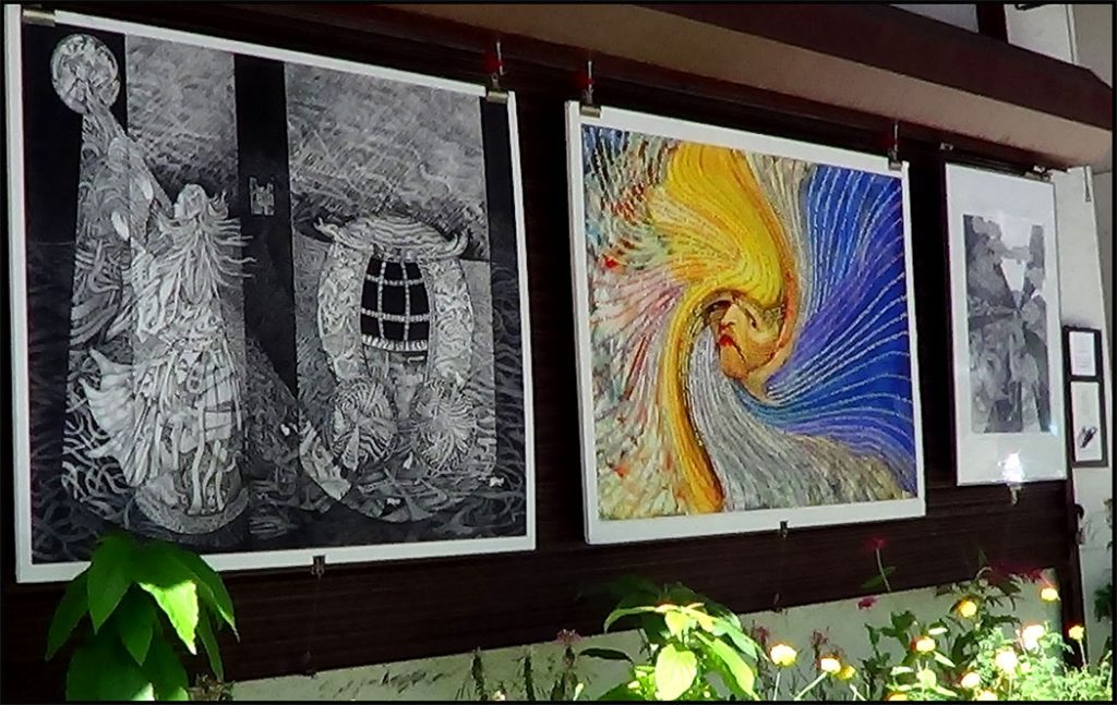
Left: Midnight – John Watts’ Artwork
Middle: Vincent van Gogh and his letters to his brother – Ing-On Vibulbhan-Watts’ Artwork
Right: Homage to the Dragon – John Watts’ Artwork
Ing-On Vibulbhan-Watts and John Watts, Saturday, November 30, 2019
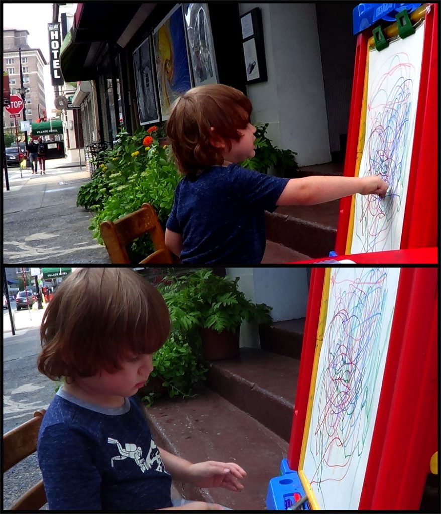
Kai, The Artist our grandson, who just turned four years old.
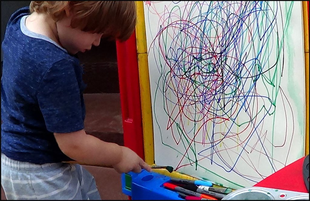
Kai, the Jackson Pollock wanna be.
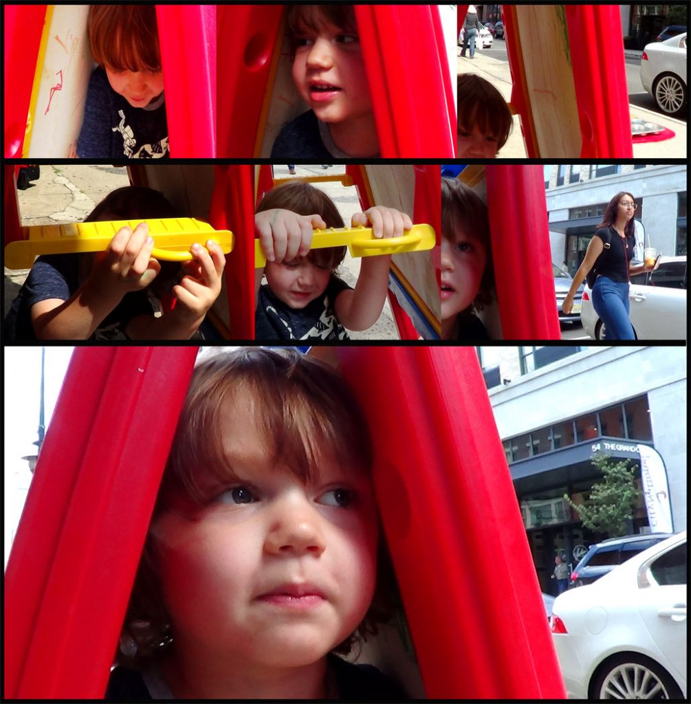
It was time for the four-year-old artist to relax and play.
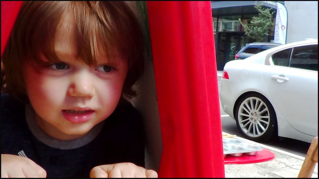
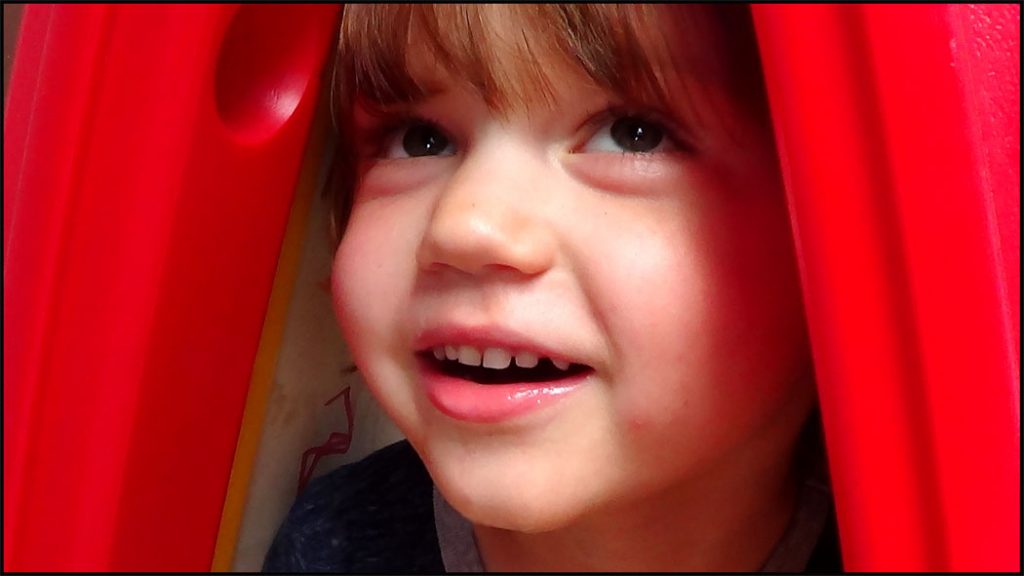
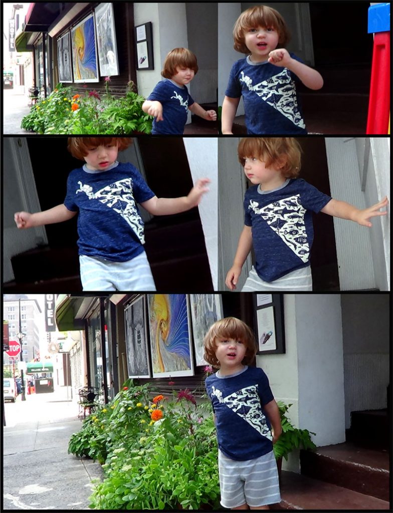
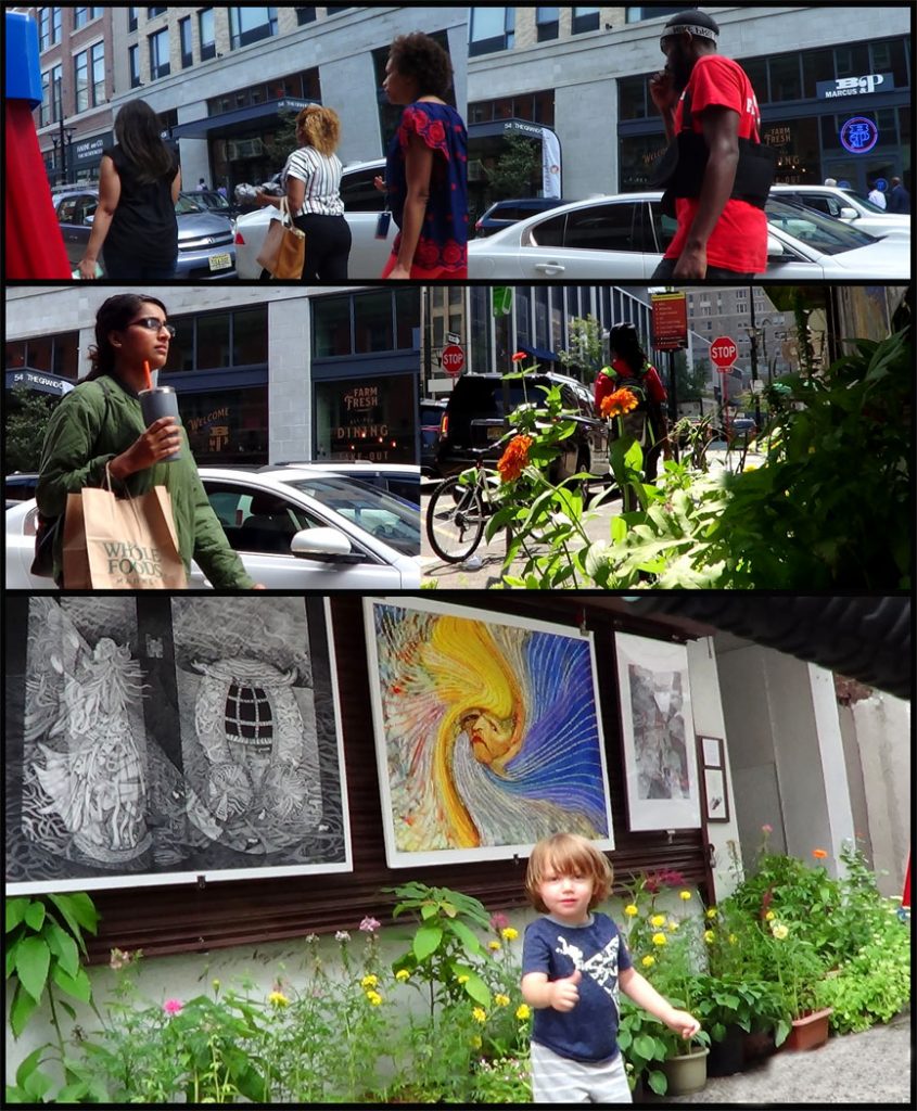
I have a better chance to learn human behavior and development from our grandson than our only daughter when she was young. This was because we were so busy with working and now we have more time to observe our grandson’s interaction with other children, including his behavior as a baby and his progress up to now.
For more information please visit the following link:
Ing & John’s Street Art and International Street Art-Part 7
Ing & John’s Street Art and International Street Art-Part 8
International Street Art – Part 8
Murals of Greek Gods Rendered Against a Chaotic Backdrop of Graffiti by Pichi & Avo, and Crumbling Buildings and Graffiti-Covered Walls Are Meticulously Documented in Oil Paintings by Jessica Hess
Murals of Greek Gods Rendered Against a Chaotic Backdrop of Graffiti by Pichi & Avo
March 4, 2015 Christopher Jobson
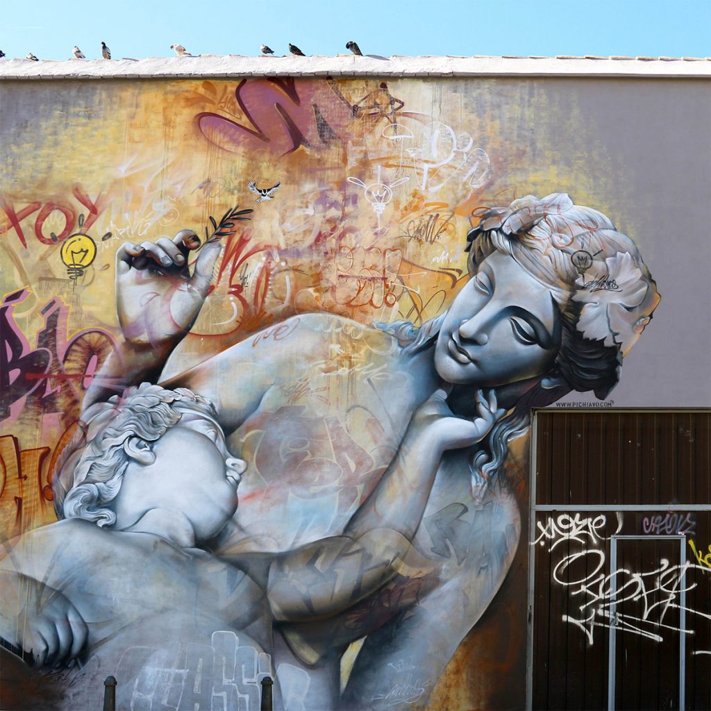
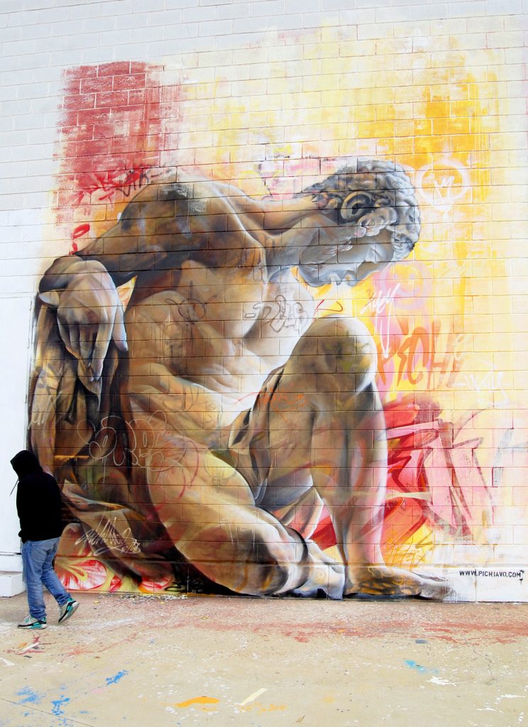
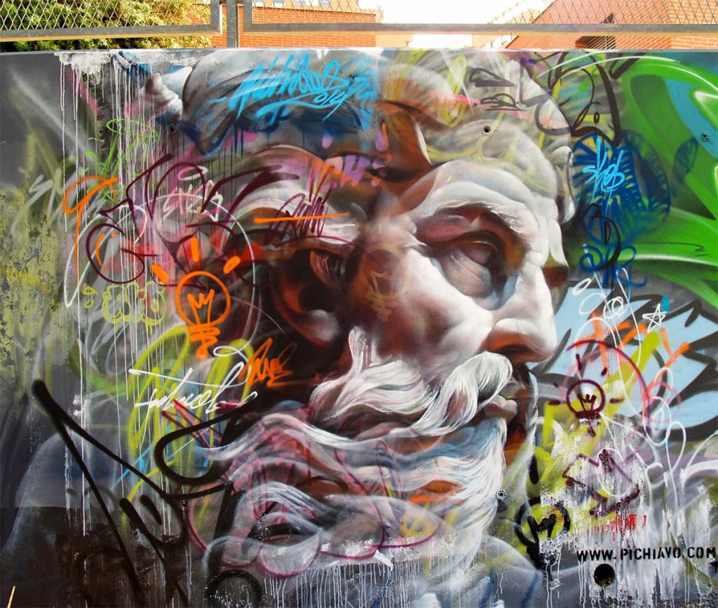
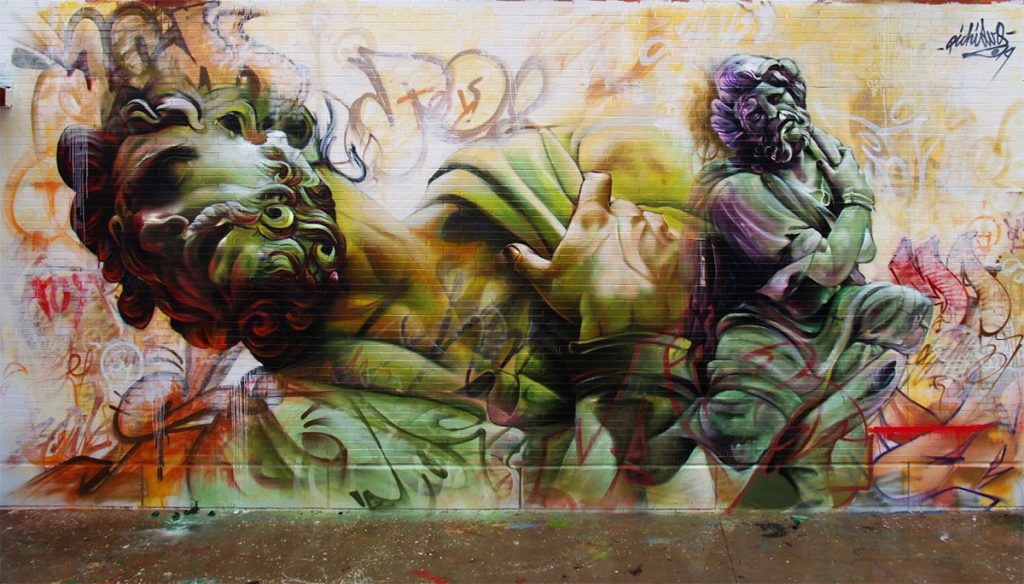
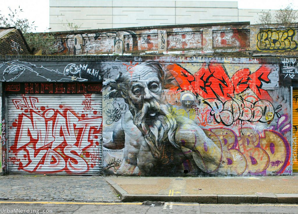
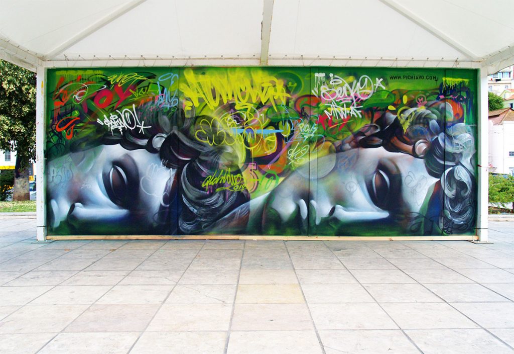
Since first collaborating in 2007, Spanish street art duo Pichi & Avo (previously) have created an intriguing blend of traditional graffiti and renderings of mythological figures influenced by ancient Greek sculpture. The precision, shading, and use of color is all that more impressive considering each piece is painted only with spray paint. Pichi & Avo open their first exhibition in Italy titled Urban IconoMythology later this week at Basement Project Room. You can see more of their work here. (via Illusion, Graff Crew, UrbaNNerding, I Support Street Art)
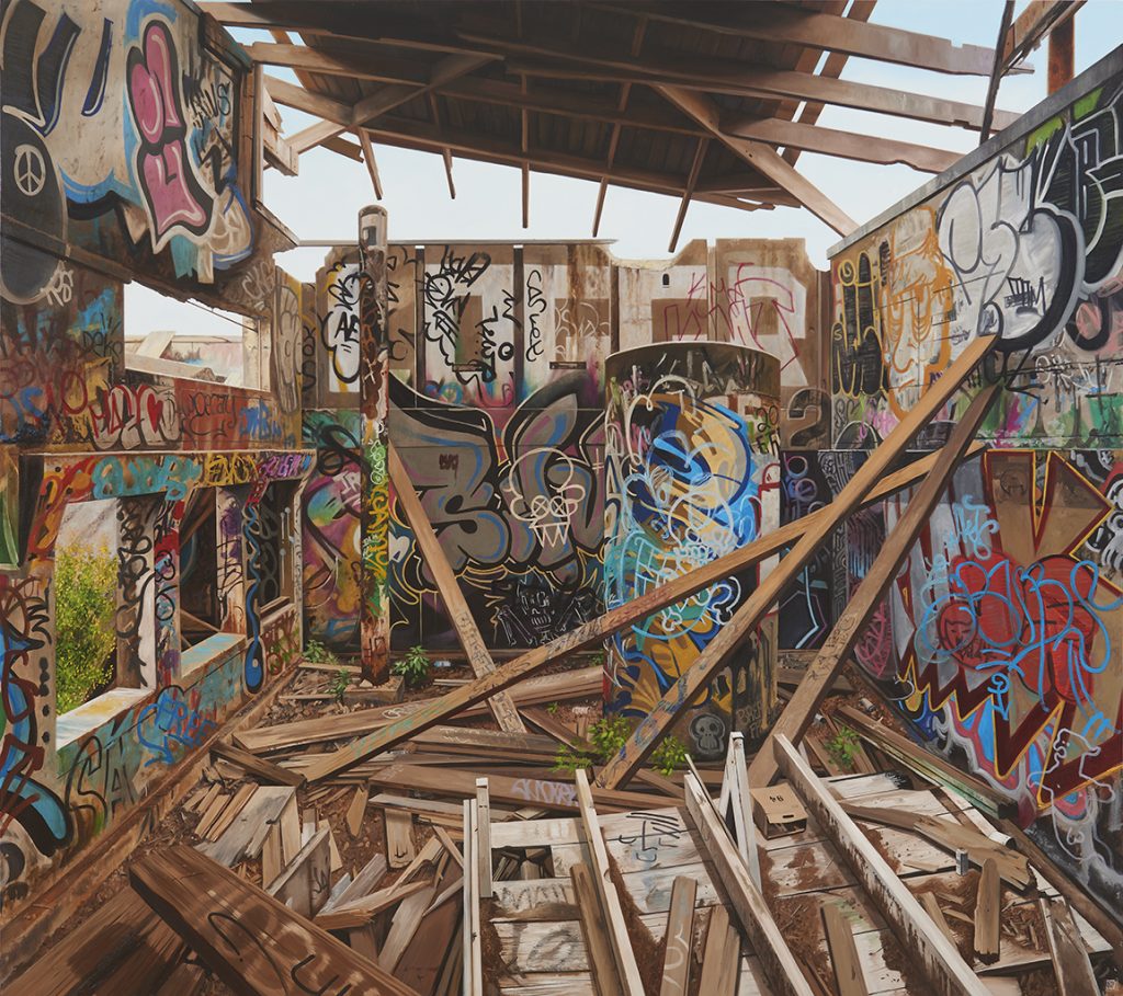
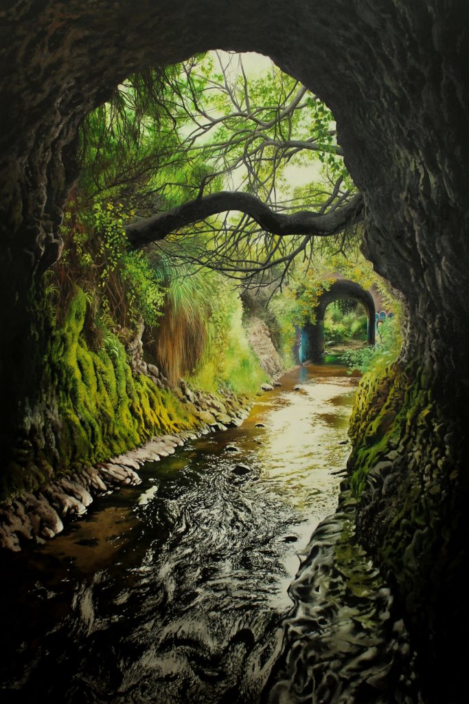
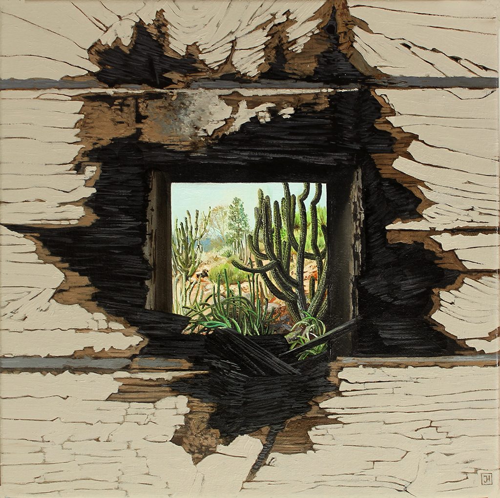
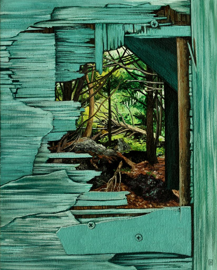
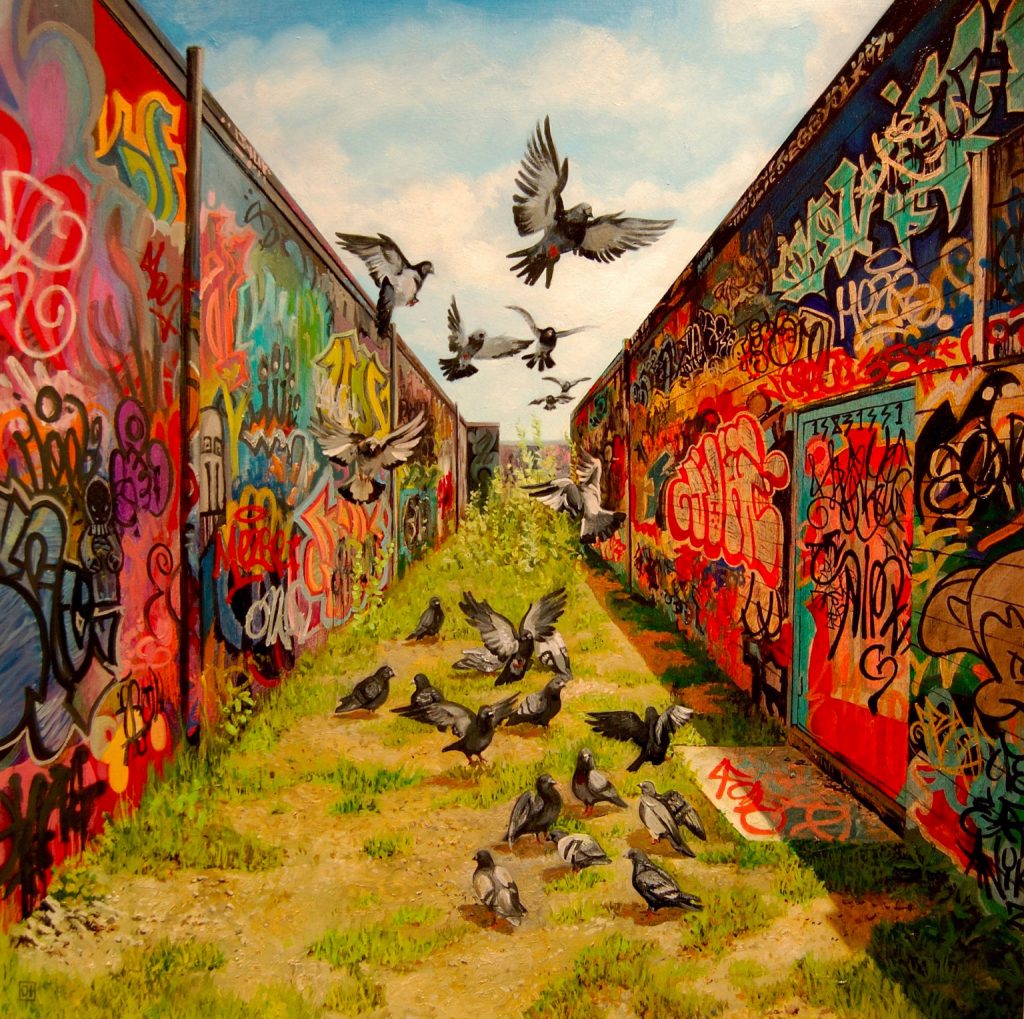
Oakland-based painter Jessica Hess documents landscapes and built environments in moments of transition. Combining open skies and lush plant life with crumbling walls and frayed rebar, Hess finds equivalency in growth and decay. The artist, who works in oil paint, shoots photos while exploring abandoned locales, and uses these real-life references to build her carefully framed worlds on canvas.
Hess graduated from Rhode Island School of Design and has been exhibiting nationally for over 15 years. Her solo show, The Chaos Aesthetic, is currently on view at Hashimoto Contemporary in San Francisco, and runs through May 25, 2019. You can keep up with Hess’s impressive exhibition schedule, which includes four additional shows this year on her website, and see more of her work on Instagram.
For more information please visit the following link:
Ing & John’s Street Art and International Street Art-Part 8
A Quick Guide to Amazing Bird Photography Compositions
A Post By: Jaymes Dempsey
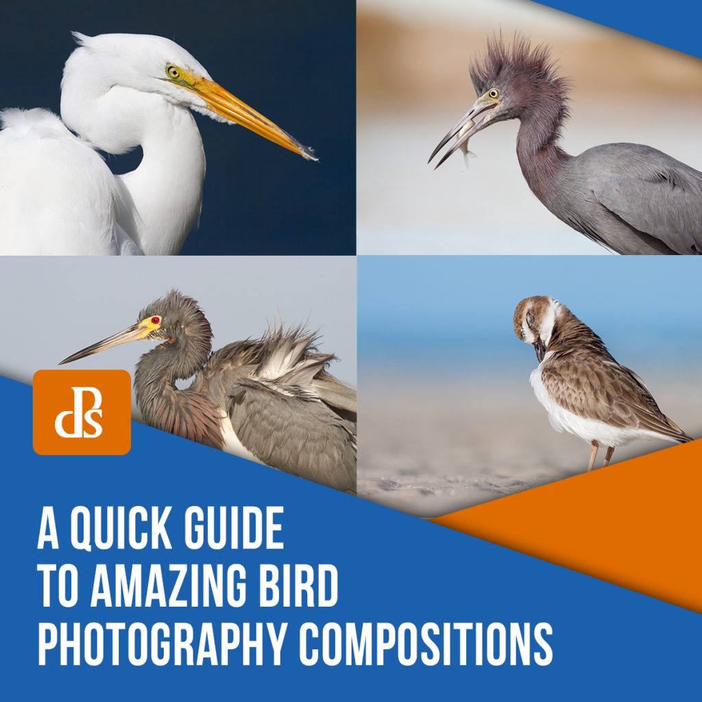
Do you want to capture amazing photos of birds? If so, you have to master bird photography compositions.
Composition refers to the arrangement of elements within the photo. And it’s often the difference between a creative, compelling image, and an image that just falls flat.
In this article, I’m going to share with you everything you need to know about bird photography composition. I’m going to give you several tips that ensure you capture beautiful bird photography compositions, without fail.
Sound good?
Let’s dive right in.
The composition basics: Capturing a gorgeous bird photo
When you take a bird photo, everything in the frame matters.
The bird. The position of the bird. The position of the bird’s head. The background. Any elements behind the bird. Any elements in front of the bird.
It’s all important.
Because the key to a gorgeous bird photography compositions is keeping the shot focused on your main subject.
You want to make sure that the bird stands out in the frame. You want to make sure everything else in the photo emphasizes and enhances the bird.
So how do you do that?
A few simple ways, starting with:
Simplify the entire composition to make the bird stand out
If your composition is chaotic, then the viewer is going to get lost.
And that’s absolutely not what you want.
Instead, you should aim to simplify the composition as much as possible. The best compositions tend to include a bird and a background. That’s it.
While it’s possible to create beautiful shots by including additional birds or interesting features (e.g., shells, flowers), I recommend avoiding that as much as possible. These mess up compositions more often than they enhance them.
Also, in the interest of simplicity: If there’s anything in the frame that’s distracting, get rid of it. So make sure there are no branches behind the bird. Make sure there’s nothing in the background that dominates the frame or draws the eye.
That’s how you’ll keep your bird photography compositions beautiful.
And speaking of backgrounds:
Aim for a uniform, simple background that makes the bird pop
If you want a beautiful bird photography compositions, then you need a beautiful background.
What does this involve?
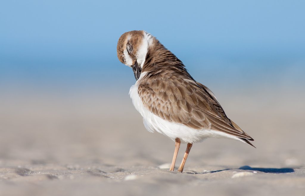
First, the best bird photography backgrounds are simple. They’re also uniform.
Like this:
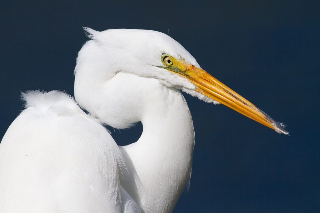
Notice how the background is a nice uniform color.
It keeps the attention on the bird. It doesn’t distract.
To create a background like this, you want to start by ensuring a large separation between the bird and the background. One trick is to get down low, on the bird’s level; this will cause the ground behind the bird to fall away, creating a more distant background.
You should also make sure you use a decently wide aperture, such as f/5.6 or f/6.3 (the particulars depend on the size of your bird, because you don’t want to accidentally make parts of the bird soft!).
Finally, you should ensure that the background doesn’t include colorful elements that catch the eye. Before you take a shot, look behind your bird, and ask yourself: Will anything in the background dominate the frame? Will anything pull the viewer away from the bird?
If the answer is “Yes,” then you should consider moving slightly to the left or right so that you’re no longer stuck with a distracting background.
Use the rule of thirds to position the bird’s eye
Now that you know how to capture beautiful backgrounds, it’s time to look at your main subject and how to position it.
Generally speaking, you’ll have a single bird in your photos. And you need to position this bird carefully.
You don’t want to put it smack-dab in the middle of the frame. That’s a recipe for a boring, static composition.
Instead, I recommend you place the bird so that its eye falls along a rule of thirds power point.
What is the rule of thirds power points?
They’re simply points that are a third of the way into the frame, both vertically and horizontally.
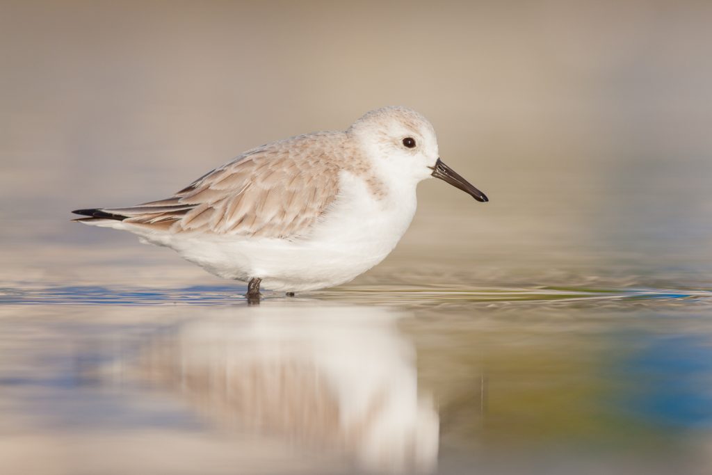
The eye in this photo, for instance, falls along a power point:
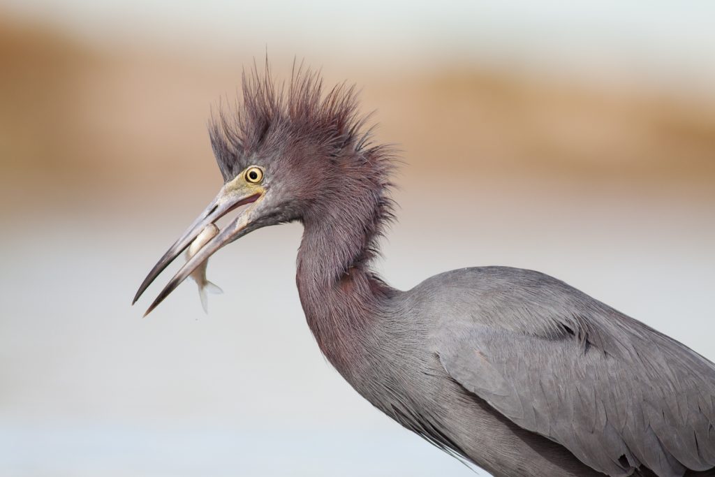
It’s a third of the way down, and a third of the way from the left.
Now, the rule of thirds is misnamed; it’s a guideline, not a hard-and-fast rule. But it is a great way to position your bird and will ensure that the shot feels a lot more interesting.
So use the rule of thirds whenever you can to position your bird within the frame.
Point the bird into the frame to add movement
I’ve talked about positioning your main subject using the rule of thirds, but there’s another aspect to positioning that you should always, always consider:
The direction the bird is pointing.
You see, most bird photos have some empty space in the frame.
And when they do…
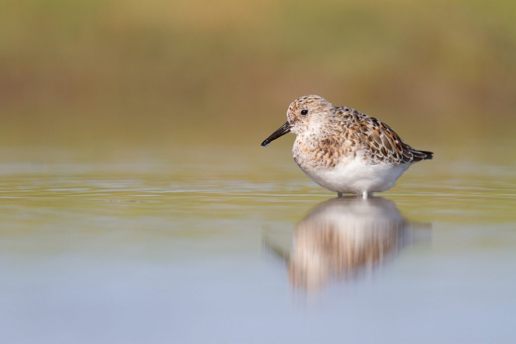
…you want to point the bird into the empty space, rather than away from it.
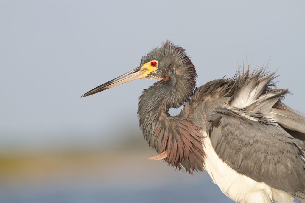
You see, by making sure the bird is looking into the empty space, it adds a sense of completeness and a sense of motion to the frame. The viewer’s eye follows the birds line of sight, and everything feels satisfying.
Whereas if you point the bird out of the frame, the whole shot feels tense. The viewer wants to know what’s outside the frame, with no resolution in sight.
That’s why bird photographers love to point the bird into the frame. It’s far more satisfying, and can turn the shot into something powerful.
Capture the bird in a creative pose for increased interest
Now, when it comes to bird photography, you can capture birds in a normal standing pose.
And that’ll get you some nice photos.
But sometimes…
This isn’t enough.
If you want to create truly creative bird photography, you need to go beyond the simple standing pose. And capture the bird doing something interesting.
What counts as interesting?
For one, preening birds look really interesting. They appear wonderfully tranquil as they clean their feathers.
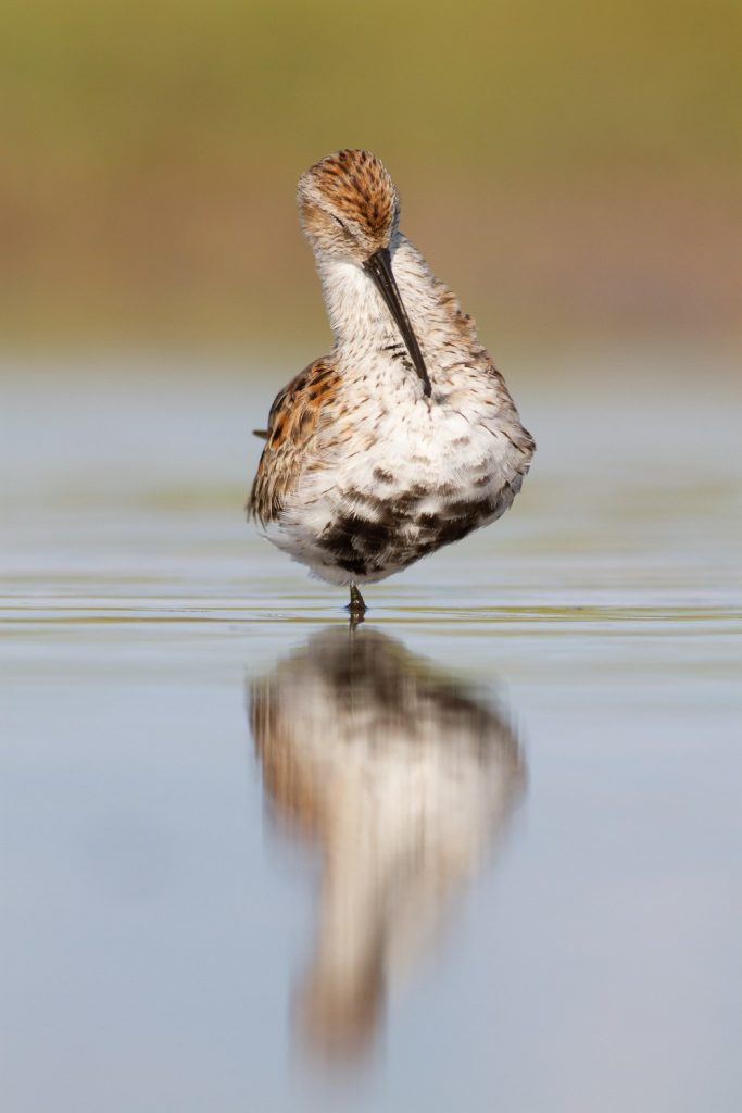
And birds that are sleeping also give off a sense of peace that I love.
You can also go for action shots: Birds feeding, for instance, can create a lot of interest. You can capture photos of birds that are about to catch food, are currently catching food, or have just caught food. Think of a bird with a huge fish in its mouth.
It’s guaranteed to add interest.
Cool, right?
You can also go for shots of birds fighting or, as is a common bird photography practice, shots of birds flying. Photographing birds in flight can be a challenge, but a really rewarding one.
So whenever you’re able, don’t just take a standard bird photo. Go beyond this.
Make something unique!
A quick guide to amazing bird photography compositions: Conclusion
You should now have a sense of the best ways to capture beautiful bird photography compositions.
And remember:
Getting amazing compositions isn’t hard. You just have to use the tips that I’ve given you, and you’ll be taking stunning photos in no time.
Have other tips for gorgeous bird photography compositions? Share them in the comments!
Read more from our Tips & Tutorials category
Leave a Reply